At Dedicated Designs we are always excited to work with an organization to create a brand identity that intrigues and resonates with their target audience. Here we will share insight into an inspiring recent logo redesign for DQM Connect, a fleet management software that will revolutionize the trucking industry.
Fresh Design in an Established Industry
The DQM Connect team was looking for branding that would help set them apart from their competition in an industry that tends to be a little dated. Our goal with the rebrand was to deliver a bright and colorful logo with a modern tech SaaS feel. The client wanted it to match their fun and friendly vibe, making sure it was approachable and unintimidating.

The Dedicated Designs branding and graphics team knew we wanted DQM to feel connected and seamless as a nod to the software. We used lowercase lettering to create a friendly and approachable company logo design. The image above is the first round of ideas we shared with the client, and from there we were able to focus on a few options that matched what they wanted but needed a little revision.
Color Connections

For round two we narrowed in on three options, all revised to have a more connected feel. We incorporated color variations, from a rainbow gradient to blues and greens. Ultimately, the center option above became the winner, as it best embodied an approachable but professional balance.
Each letter flows into the next – creating a seamless and connected look, so much so that “dqm” could stand alone without the word “connect” once the brand has been around for a while and gained brand recognition. The winner of this round (the center option above) was revised further, and given a few color variations.
The Finalized Logo Redesign

The new logo has the SaaS look the client was looking for with an approachable and friendly feeling. The client chose green tones that transition smoothly from their original logo. The letters “dqm” are purposefully connected, flowing from one character right into the next. It’s not only a play on the company name, but it also highlights the seamless feeling customers will have using their product.
From Logo Branding to Website Design
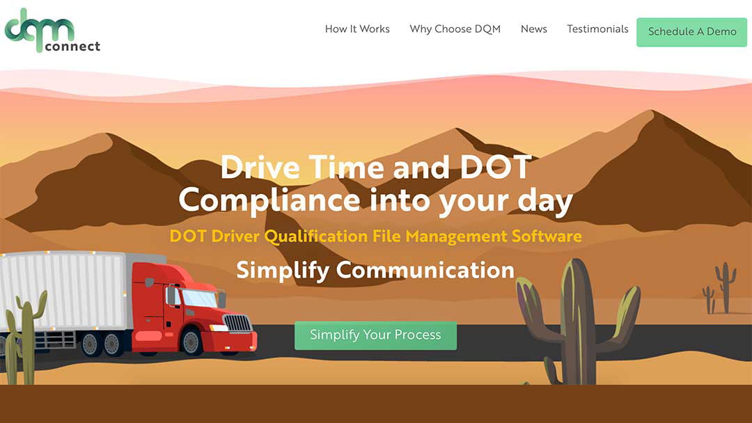
The updated DQM Connect logo was then used to create a modern web design for their software solution. Design of the website seamlessly pairs with their logo, resulting in a strengthened brand identity.
Does Your Company Logo Design Need a Refresh?
The team of experienced creative professionals at Dedicated Designs is ready to help you create or redesign a logo that showcases your brand’s purpose and personality. Bring your brand identity into modern design styles that resonate with your target audience. Get in contact with Dedicated Designs today!


