In October 2023, the Randy Peters Catering company began working with Dedicated Designs branding team for a complete rebrand of their current materials. The local catering company, which offers large and small-event catering services throughout Sacramento, has been a hallmark catering company for the last 30 years.
As an established and community-focused business in the area, the Randy Peters team felt the need to update their branding to reflect their business’ direction and legacy for years to come. Specifically, the leadership team at Randy Peters wanted their rebranded materials to reflect the hard work and dedication they have put into establishing a high quality catering brand throughout the past decades.
This branding redesign, which changed all aspects of their branding throughout their business, completely reformatted all levels of Randy Peters’ physical and online presence.
Aligning Visions of New Branding
The beginning of any branding process with the Dedicated Designs branding team starts with a comprehensive intake meeting, in which the team learns about the client’s needs, goals, and aesthetic preferences. For this project, the Dedicated Designs branding team discussed initial visions and goals with the Randy Peters team, all the while learning about the client from a personal perspective.
To give us an even deeper understanding of their space and brand personality, the Randy Peters team welcomed the branding team from Dedicated Designs into their venue spaces and gave them a tour of their amenities. During this tour, the branding team was able to pick up on small details throughout the spaces and tie them into their overall branding, including adding rose-themed details to their final branding to commemorate the Randy Peters Rose Room venue.
Throughout this tour and the following discussion, it became clear that the Randy Peters team wanted to elevate their branding from its current state to a timeless lifetime brand. When deciding on a tone, they wanted to emphasize a feeling of “historical luxury,” focusing on large brands, like the Ritz Carlton or Nordstrom, as their main inspiration.
It was important to the Randy Peters team that their personal brand and vivacious personality continued through to their rebranded materials. Their goal was to pay homage to their long history in the community while also injecting a new breath of life into the brand as a whole. This was a balancing act for the Dedicated Designs team, who made sure to incorporate their company’s ethos and mission into the new look. In completing this switch to historical luxury-focused branding, the clients hoped to further elevate their image, bring in new clients, and prepare their brand for longevity.
From there, the branding team presented initial mood boards for their brand as well as color and logo options to the client, who shared their thoughts and opinions. This collaborative discussion built momentum for the rest of the branding effort – and solidified the client relationship for the rest of the project!
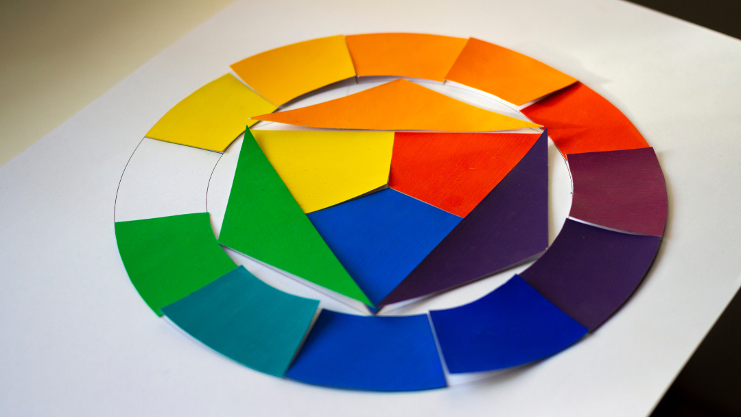
Choosing the Right Colors for the Rebrand
Once the client had decided on historical luxury as the main direction of their brand, the Dedicated Designs team started working on narrowing down a variety of colors that could communicate the overall feel of the brand to the customer.
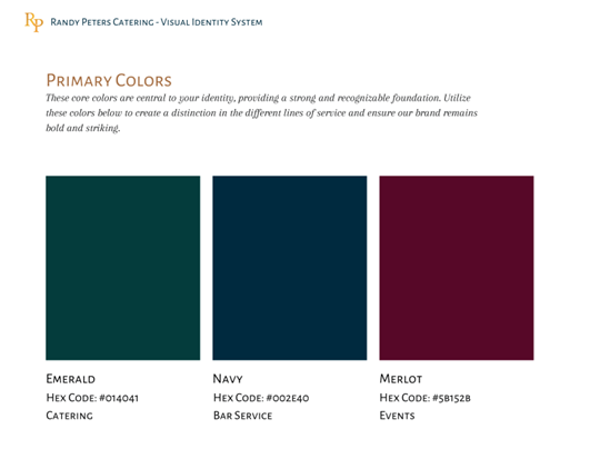
The primary colors for Randy Peters Catering’s new branding.
After researching the brand, the Dedicated Designs team decided on the colors of emerald green, navy blue, and merlot as primary colors. All of these colors conveyed the luxury and prestige that the client wanted to communicate in the rebrand, while also complementing the other visual aids that would be used throughout the brand’s in-person and online presence.
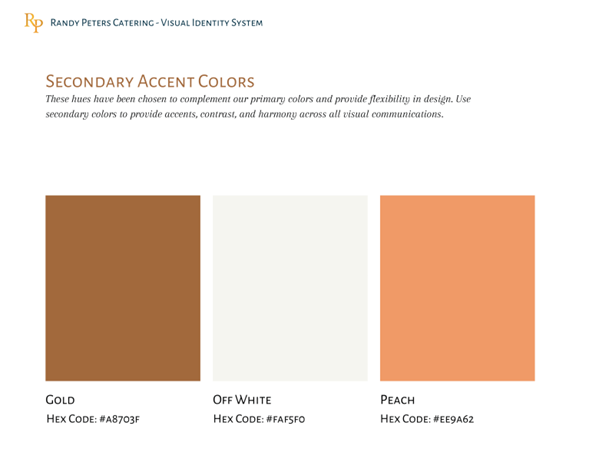
The secondary colors for Randy Peters Catering’s new branding.
For secondary colors, the Dedicated Designs branding team incorporated gold, off white, and peach tones. In general, secondary tones are used to provide accents and visual interest throughout the branding package. Adding these specific tones was a calculated choice to complement rich primary colors and convey the luxurious brand ethos running through the brand as a whole.
Using a Tiered Approach to Deliver Rebrand Results
The branding created for Randy Peters Catering had to reach far beyond their online presence. Randy Peters had to have multiple types of logos and branding because they offer a wide variety of in-person services including small event catering, large corporate events, wedding catering services, and much more.
In order to complete this challenge, the Dedicated Designs branding team created a tiered system for all Randy Peters logos and branding. This system ensured that while all levels of the branding corresponded with one another and fit the same aesthetic.
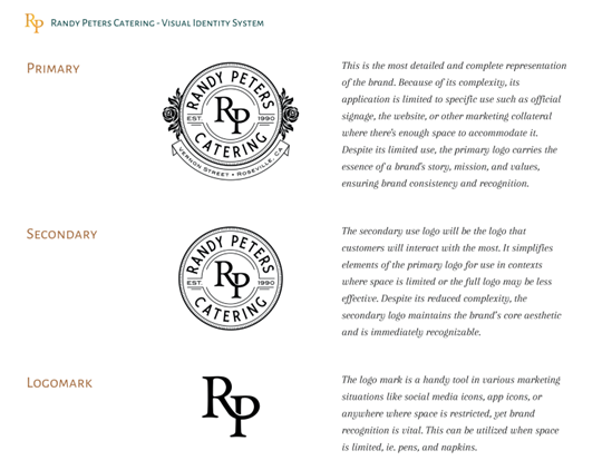
The three-tiered visual identity system for the new Randy Peters Catering logos.
The first tier includes the main logo, which would appear on their building facade as well as their delivery vans, chef’s coats, and napkins. This logo is important because it conveys the largest sized logo and full brand identity of Randy Peters and, as such, is used only in select locations that can accommodate the size and brand details.
The second tier of branding is the tier arguably used the most by the catering company as a whole. This tier is slightly smaller in size than the main logo and can be used in the majority of spaces that need a moderate-sized logo. This is the logo that customers can see on Randy Peters’ servers’ uniforms, menus, and marketing materials.
Finally, the third tier of branding, or the “logomark,” conveyed the new Randy Peters aesthetic in the most minimalistic manner possible. This level of logo would be used on the smaller products to convey the Randy Peters brand, including stationary, pens, and social media posts.
Making Sure Everything was in Place
The Randy Peters clients wanted their branding to be ubiquitous throughout their business and events. In order to do this, they worked with the Dedicated Designs branding team to assign a purpose and location for each logo created during the larger process.
With an incredible level of detail, the Dedicated Designs branding team worked with the client to ensure that all branding locations matched with the clients’ preferences. The tiered system described in the section above was incredibly useful when determining brand locations and assignments. Because each tier had a different size and level of detail, the system made it easier to categorize where each logo would go throughout the business.
Design with the End Goal in Mind
Throughout the rebranding process, it became clear that new branding and logos would be needed and incorporated throughout both the in-person and online presences of Randy Peters Catering.
To ensure that all levels of the new branding would be available in both online and printed formats, the Dedicated Designs branding team created all new imagery with a multipurpose end goal in mind. Following these parameters, all branding and logos were made to be completely compatible with online platforms, including multiple social media formats and throughout the entirety of the new Randy Peters Catering website.
As the hallmark catering company moves forward and expands, they’ll be able to use the new logos and branding on any new materials, including new iterations of their uniforms, signage, flyers, and website pages.
Building Trust with the Client
Building a client relationship with the owners and leadership team at Randy Peters Catering was a quick and easy process that led to a lasting relationship built off care and attention for the client’s needs. After the initial intake call, the Dedicated Designs branding team held regular meetings with the client to make sure that all progress was happening in line with their preferences throughout the entirety of the rebrand effort.
Through these conversations, the Dedicated Designs branding team built up an understanding of the client’s wants and needs through thoughtful listening and consistent communication and built a strong relationship with the Randy Peters team. From this relationship, the design team could more readily deliver a variety of high quality options tailored to the client’s preferences.
Work with Dedicated Designs
When this rebrand project was completed, Randy Peters Catering had a new aesthetic that conveyed historical luxury and lasting legacy to their customers. With this full branding redesign, the catering company has been able to completely update their physical and online presence.
If you are interested in working with Dedicated Designs to start redesigning your company’s branding, reach out to Dedicated Designs today.